
|
After listening to executives, product managers and marketers, I've created compelling visual symbols for businesses, products and services Logo and identity design to embody aspiration, difference, and authorityBranding, the shaping of the many aspects of business that the public experiences, is an activity whereby smaller company conspires with a successful and savvy designer to help them create positive experiences for customers and prospects. In some larger organizations branding responsibility is spread across a large committee, with the designer as visual specialist. All the examples below reflect more than mere decoration. Rather, they testify to the trust put in me to confidently express a unique, recognizable, and easy-to-recall professional personality in the marketplace.
Enduring, international, and iconicNam libero tempore, cum soluta nobis est eligendi optio cumque nihil impedit quo minus id quod maxime placeat facere possimus
Twenty five years ago (!) Crestron was not the global audio-video control system behemoth of today. When I started there as visual marketing specialist, the private technology company expressed and referred to its own name in only upper-case Helvetica. Company literature and press releases came peppered with CRESTRON, a wiring diagram, and a big CRESTRON at bottom. There was little appetite for change until I created a product logo with a multicolor swirl design for their first color video touchscreen device. Elsewhere, I'd quietly finessed the letter spacing in the CRESTRON wordmark and paired it with the colored (and eventually pms 541 blue) swirl. And voila, a uniform visual identity was born!
Visitor metrics that exhibitors craveFor exhibitors and organizers, TrackMany™ delivers event metrics like traffic patterns, visitor count, engagement, dwell time, age, gender and sentiment. It was one of 10 finalists for the 2019 Tech Watch Awards at IBTM World in Barcelona. I describe this identity and related projects elsewhere on this site.
Reporting on the AV industry pulseAnother long-lived logo, also familiar to anyone in the Professional Audio Video ("ProAV") world, is for a news organization begun in 1998 by Gary Kayye for “AV insiders.” Shown here is my original launch version which remained intact for many years. Its in-house evolution has retained the basic form – with the distorted “AV” bursting out of “rave.” but now sports a strong and contemporary solid purple with attached sub-brand text variants. Importantly, I’m also responsible for naming the business venture, in tandem with designing this original art. It’s a joy to work simultaneously with words, their meanings, and tweaks and imagery that brings them to life, together.
A medical devices marketing master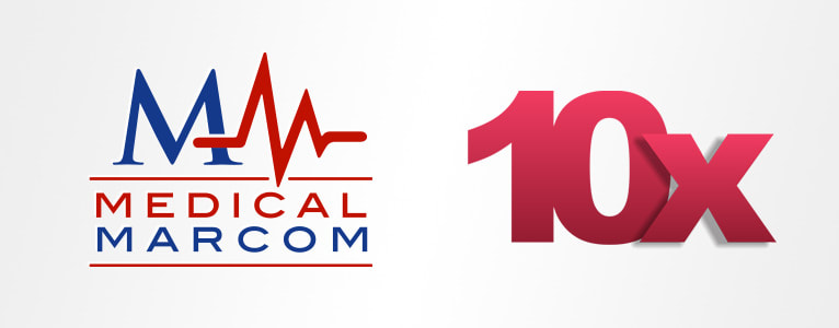
In the medical devices world, entrepreneur and marketing guru Joe Hage enjoys high visibility and a sizable following. His Medical Marcom consultancy helps device companies raise their profile, build their brand, and get product to market. Meanwhile his 10x networking and exhibit events steadily grow in number and in size, both domestically and abroad. These organizational identities have appeared in and on many projects over the years.
A free 3rd color for startup’s identityInspired by the songbird that inspired a sound engineering entrepreneur, this horizontal lockup (standardized arrangement of logo plus wordmark plus text) when printed on stationery with two transparent PMS inks, yielded a dark third color at no extra cost. By itself, the stylized bird drawing may never be confused with a proper Piranga olivacea, but adjacent to the wordmark, with its artfully modified typography, the combination strikes a unique and professional note.
Inspiration for employees, customers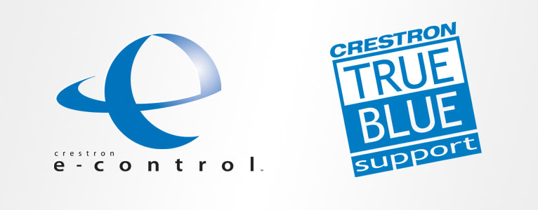
As art director and senior designer (or as the worldwide VP who I answered to called me: Chief Creative Scientist) at Crestron, I devised many visual identities for technologies, products, and programs. I frequently worked with executive and manager clients regarding naming too. The mission was always to create something that would resonate with external audiences who were technical- and sales-minded. The internal audiences were at least as important. Launching the True Blue visual identity as the customer support department rapidly grew was a visual reminder of a commitment made and expected. It became a successful internal rallying symbol and eventually made its way into customer facing media.
Product story distilled into an image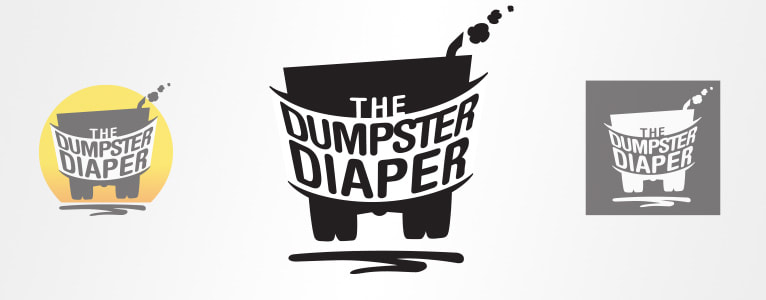
A logo doesn't have to depict what a business does or makes, but sometimes that works pretty well. Unlike the virtual world of software and services, The Dumpster Diaper is used by those who get their hands dirty. More importantly, this simple invention saves carting fleet operators money and time otherwise spent on damage complaints and legal problems. My job was to suggest that everyone – carting businesses and the communities they drive through – would all be happier keeping dangerous, bouncing truck rubble off of public roadways.
|
|
© BRUCE COLTHART CREATIVE LLC
|