|
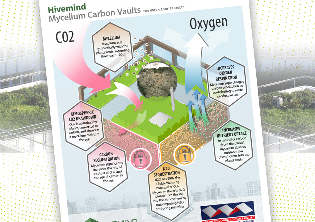
My graphic design skills, combined with semi-technical illustration and copy-drafting capabilities, translated complex science into eye-catching report cover art suitable for poster or exhibit design. Design, art, and copy editing for carbon sequestration projectI gambled. My bet was that I could generate demand for – or at least interest in – something beyond what the client had requested.
|
|
Business was slow and I craved an illustrative design project to highlight my visual story skills. This particular client wanted to explain a process in a single image. Despite a tiny budget I decided to go beyond bare bones fulfillment and add significant value, delivering a polished execution when “simple” was the request.
I’m lucky – I get to learn all about cool new stuffThe deliverable was an image (and later a page) to incorporate into a proposal. The first audience was Shell Oil [UK]. In line with their environmentally-friendly retail facilities initiative, Shell entertained green roofing for a prototype London station. The low, dense plantings on a vast canopy above the pumps checked several boxes: capturing excess water runoff; filtering atmospheric carbon dioxide; sequestering other greenhouse gases; and generating oxygen. My client's expertise was with mycelium, the fine tendril-like fungus often found among plant roots in healthy soil.
Most times, the designer, brander, communicator and businessperson in me proceed harmoniously, making prudent compromises. But this time the “good enough” impulse was subdued and I aimed higher. If the technical exposition could be made more dramatic, would it not command more attention and respect? Would it not elevate the company brand – a small business with big talent and aspirations – to the notice of other large corporate and industrial planner customers?
|
Into the first projectI happily learned plenty about greenhouse gas sequestration in soil, and the solution my client's fungal product and expertise offered. I was free to ideate and imagine that solution visualized, captured in a still image, and free to empathize with the viewing audience.
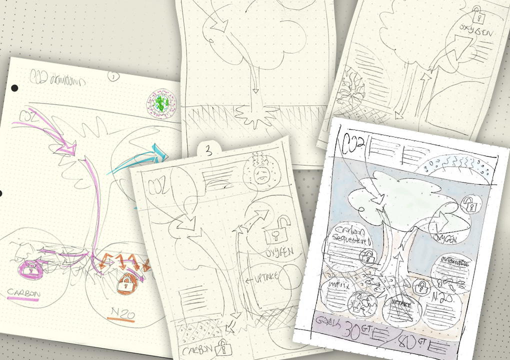
My first sketches stressed plant life's natural air-cleaning. A tree theme seemed simple, comprehensible, substantial. I soon learned how ridiculously inappropriate a big tree is to green roofs! So why not focus on the roof itself? Also, treating this as a poster design versus a mere schematic process would better engage and add value. Clearly this would more than satisfy “a graphic to include in a document.” Multi-purposed, it could be a mailer or exhibit signage.
|
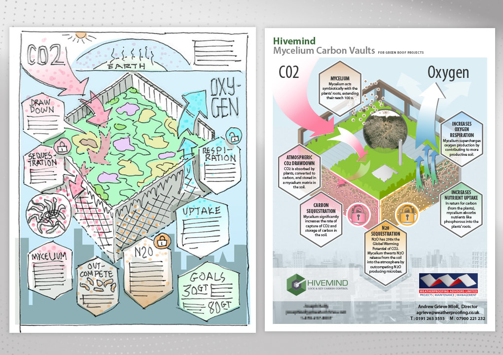
The ultimate hand sketch (left), prior to precise digital layout, marks the end of my favorite phase. With the earlier tree idea behind me, the new "pie slice" idea proved better. The building's roof type was further defined in the ultimate pdf (right) with contemporary glass fencing and a sidewalk, signaling the growing trend of roof use by people.
|
I accepted that this extra effort would likely not be appreciated or pay off immediately. It was a loss leader. It was worth opening the client up to the value of a quality product and the brand-building possibilities they hadn’t yet imagined. To stay within budget, I planned to outsource the work.
I discussed all this with the client, who rewarded me with a thirty percent bonus over the budgeted price (still in the hundreds of dollars) for this one project. Never learned if the deliverable lived up to its potential, as the working relationship would soon end.
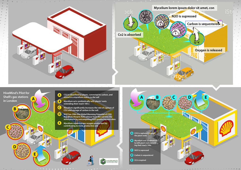
Next project“Now that we have the general science and process captured in a still image,” I recall the client saying, “we need something similar, but more specific to Shell petrol stations. We need to show a gas station roof as a green roof. And the budget is the same as the first project.”
Designer (me, the problem-solver): “Hmmm... you can't afford drone images of petrol station roofs... Can your people get roof-oriented photos from Shell? Then I'd figure out how to ‘green’ them." Meanwhile I'd search stock photos, though good results seem unlikely. Yet I did discover a stock illustration (see red image below) that could be built upon.”
|
And then we broke up[Warning: oversharing ahead] As I finished up this second project, the client became less communicative and more impatient. Our good working relationship deteriorated. I was accused of driving up prices, called unprofessional, and chided for my disregard of startup budgets. Oh, and I "wasn't doing my job!" – specifically, I had dropped image research into his small team's lap, and also had "outsourced design decisions" to him, the client.
To be fair, the client was stressed by a short deadline, a small team, and a tiny budget. But I'm less understanding of the accusations. It's worth noting that:
What did I learn?I acted in good faith, executed the requested projects, heard him out, worked to salvage the relationship, and was rewarded with silence and no payment, for completed work on this second project. (By the way, the project was small so no contract involved.)
It's all a reminder that I need to be even more clear about both parties’ expectations, no matter the project size or deadline. I know small business people are busy, and this was, to him, a “simple” (more about that term someday) project. My respect for his endeavor wasn't reciprocated. The good working chemistry of the first project, was replaced with the venting of frustrations and the demonstration of his real values. ¯\_(ツ)_/¯
|

